
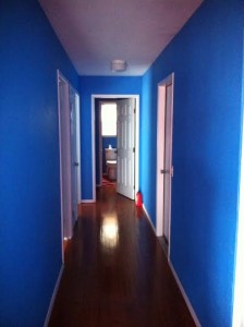
 We have this hallway. You know the hallway I’m talking about. No windows, and no natural light. I feel like I’m walking through a dungeon every time I go through it. It was originally painted this wildly bold blue color. Now don’t get me wrong, I’m all about the fun bold colors, but in moderation. This boldly blue hallway just feels dark and I feel like the walls are caving in on me every time I pass through. It’s time for a change. It’s official! It’s home improvement time!
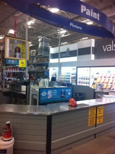 My husband and I headed over to the Color Center at our local Lowe’s home improvement store. I was excited about the Olympic Paint color selection, which is a brand exclusively at Lowe’s. They had an incredible selection of colors and I couldn’t help myself, I came home with a huge stack of swatches. I learned that Olympic paints are engendered to endure in order to empower you to create enduring beautify in your home, and as every Mom knows we all need something that will last. The Olympic Paints and Stains Color Center allows people to browse paints and stains in one place. The colors are organized to make finding and comparing shades easier than ever. From light pastels to dark accent notes, they really have the right shade for everyone.
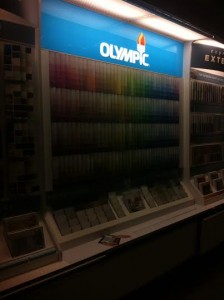 We had a chat with Henry in the paint center over paint swatches and he walked us through everything we needed to know. Yay for Henry! He taught me about paint sheens and worked me through what would be best for our home. I think we’ll go with the satin sheen. What I liked best about the satin is he said it will wash well, and all of you Moms out there know how important that is!
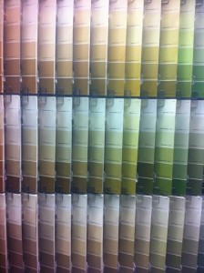 The Olympic Paint color center has room brochures that are arranged to allow shopping in 3 ways: Color (through the chips); Lifestyle (through the lifestyle brochures); Project (room and project brochures). I grabbed a lot of the paint swatches and one of their lifestyle brochures on the best neutrals. They had a lot of great neutral color options and after the bold blue, I’m really excited for some neutral in my life. The brochure is really helpful at providing great color combinations of neutrals to help you really bring a room together, or in my case a hallway. I particularly liked the look of their neutral color called vanilla milkshake. I’m thinking of leaving one wall of the hallway blue to keep the look of the ocean but to combine it with the vanilla milkshake for a powdered sand combination. I’d like to add some light yellow accents to bring in the feel of sunlight.
I’ve put together a mood board with my initial thoughts for this project:

I’ll keep you updated on our progress as we go. I’m so excited to give our hallway a new look!
Click here to learn more about Olympic Paint.
Disclaimer: I have teamed up with Olympic in support of this campaign. We received compensation for participation in this campaign. However, all thoughts and opinions are my own.